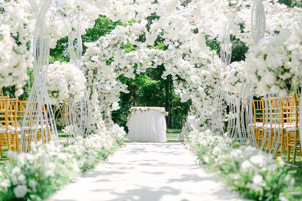
How to Choose a Timeless Wedding Color Palette (and Why the Paint Section Is Your Best Friend)
- Cara Pettit
- Dec 9, 2025
- 2 min read

Choosing your wedding color palette should feel intuitive, inspiring, and personal, not overwhelming. With thousands of choices floating around, the best approach is to simplify the process and anchor your palette in tones that feel timeless.
One of the most unexpectedly brilliant tools for finding your palette?
The paint section at Home Depot or Lowe’s.
Trust me, it works.
Start with Emotion, Not Color
Before selecting colors, consider the feeling you want your wedding to evoke:
Warm + romantic
Clean + modern
Organic + airy
Dramatic + editorial
Minimal + luxe
Soft + timeless
Emotion guides color far better than browsing random swatches online.

The Paint Section Trick: Your New Favorite Design Exercise
This is a tip I give nearly every couple.
Visit the paint aisle at Home Depot or Lowe’s together. Wander. Pull swatches. Notice what you both instinctively grab.
Why this works:
The color selection is enormous
Swatches come in unified color families
You can compare shades in real lighting
It turns the experience into a fun, interactive “design date”
It helps couples discover what they actually love, not just what they’ve seen on Instagram
Take the swatches home and assemble combinations until you find a palette that feels like you.
Build a Balanced Palette
A timeless palette includes:
A grounding neutral (ivory, sand, stone, taupe, dove gray)
A primary hue (sage, ochre, dusty rose, steel blue)
Supporting tones (soft blush, muted terracotta, deep fig, olive, charcoal)
Metallic or textural elements (gold, brushed brass, linen, marble, rattan)
These layers create depth and allow the design to evolve across floral, fashion, stationery, and décor.
Design Is Personal. Your Palette Should Be Too
A timeless color palette isn’t about choosing “classic” colors. It’s about choosing combinations that feel meaningful, balanced, and reflect your style.


Comments